By FableSquare | Digital Marketing & Web Design Agency, Bangalore | 2026
TABLE OF CONTENTS
- What Is Mobile-First Website Design?
- Why Mobile-First Website Design Is Non-Negotiable in 2026
- Mobile-First Indexing: How Google Ranks Your Website
- 7 Core Principles of Mobile-First Website Design
- Mobile-First Design vs. Responsive Design
- How Mobile-First Website Design Affects Your SEO Score
- Common Mobile-First Design Mistakes That Kill Rankings
- What a Mobile-First Website Design Project Looks Like at FableSquare
- Real Results: Mobile-First Wins for Our Clients
- How to Get Started with Mobile-First Website Design
- Frequently Asked Questions
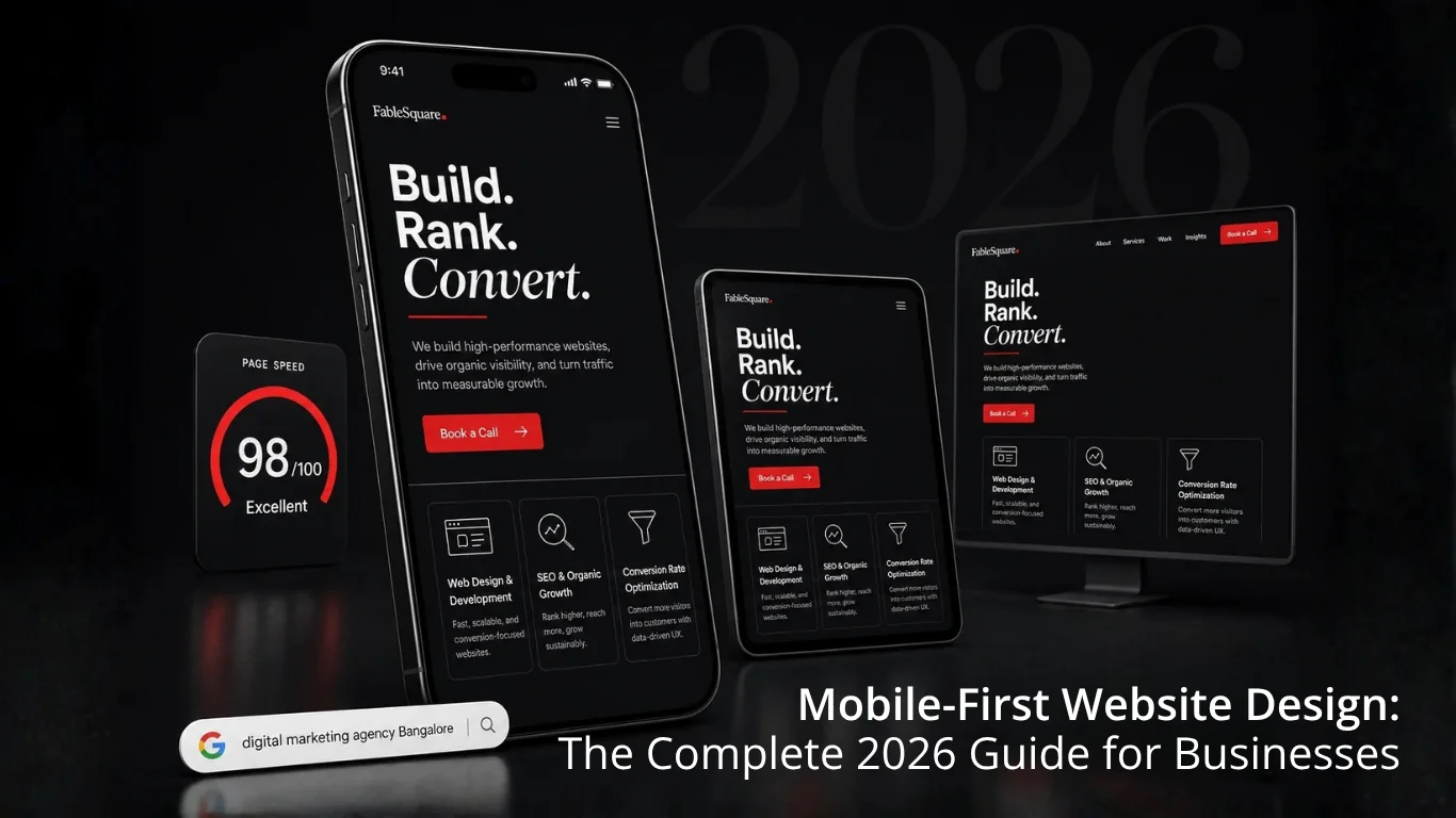
Your website is being judged on a 6-inch screen before it ever loads on a desktop. In 2026, more than 65% of all Google searches happen on mobile devices — and Google’s algorithm reflects that reality without compromise. If your business website is not built with a mobile first website design strategy at its core, you are actively handing traffic, leads, and revenue to competitors who took it seriously first.
What Is Mobile-First Website Design?
Mobile first website design is a development philosophy where the design process starts with the smallest screen (mobile) and progressively enhances the experience for larger screens — tablets and desktops — rather than the other way around.
Traditionally, web designers built the desktop version first and then tried to shrink it down to fit mobile screens. The results were clunky, slow-loading pages that frustrated mobile visitors and hurt search rankings. Mobile-first design flips that logic entirely.
In a mobile first website design process:
- Content is prioritised ruthlessly — only what matters most appears first.
- Navigation is simplified for thumb-friendly tap targets.
- Images and assets are optimised for mobile bandwidth from the very start.
- Page speed is engineered for 4G/5G networks, not fibre broadband assumptions.
- Touch interactions replace hover states as the primary interaction model.
The desktop experience is then built on top of this solid mobile foundation, adding complexity and richer layouts only where they genuinely add value for the user.
Why Mobile-First Website Design Is Non-Negotiable in 2026
The numbers in 2026 leave no room for debate:
- 65%+ of global web traffic comes from mobile devices (Statista, 2026).
- Google uses mobile-first indexing for virtually every website on the web.
- 53% of mobile users abandon a website that takes longer than 3 seconds to load (Google Research).
- Mobile-optimised sites see up to 67% higher conversion rates than non-optimised ones.
- Page Experience signals — including mobile usability — are confirmed Google ranking factors in 2026.
For businesses in Bangalore competing across healthcare, education, B2B SaaS, and retail, a site that performs poorly on mobile is not just a UX problem — it is a revenue problem. Your best prospect opens your website on their phone, sees a broken layout or waits 8 seconds for the page to load, and moves on to a competitor. That cost is invisible on a report but very real in your pipeline.
FableSquare Insight: Every website we build in 2026 is audited against Google’s Core Web Vitals — LCP, CLS, and INP — on mobile first. Desktop performance is secondary by design.
Mobile-First Indexing: How Google Ranks Your Website
Google completed its migration to mobile-first indexing — meaning Google’s crawlers now evaluate the mobile version of your website to determine how it ranks in search results for every user, on every device. You can read the official documentation on
What mobile-first indexing means in practice for your website in 2026:
- If your mobile site has less content than your desktop site, Google indexes the lesser version.
- If your mobile site is slow, your rankings suffer — even for desktop searches.
- If structured data, meta tags, or canonical tags are missing from your mobile pages, your SEO is compromised.
- If images on your mobile site are not properly sized or compressed, Core Web Vitals scores drop.
The implication is direct: your mobile website is your website in Google’s eyes. Treating mobile as a secondary consideration is equivalent to optimising a brochure nobody reads. At FableSquare, every web project begins with a mobile-first technical audit mapping crawlability, content parity, structured data, and page speed before a single design decision is made.
7 Core Principles of Mobile-First Website Design
Understanding mobile first website design as a philosophy is useful. Understanding the practical principles that make it work is what actually improves your rankings and conversions.
Content Prioritisation
Mobile screens force a hard question: if your visitor can see only three things before they scroll, what should those three things be? Mobile-first design demands you identify your highest-value content and lead with it — core value proposition, primary call to action, and most critical trust signal.
Touch-Friendly Navigation
Desktop navigation is designed for a cursor. Mobile navigation must be designed for a thumb. Buttons need a minimum tap target of 44×44 pixels. Navigation menus must collapse cleanly into hamburger menus or bottom navigation bars. Links must be spaced so an accidental tap does not trigger the wrong destination.
Page Speed Optimisation
Speed is the single most impactful element of mobile first website design from both an SEO and conversion standpoint. A one-second delay in mobile page load time reduces conversions by up to 7%. Key speed tactics include image compression in WebP format, lazy loading, minified CSS/JS, and browser caching. Understanding
Readable Typography
Body text on mobile should be a minimum of 16px. Line height should be at least 1.5x the font size. Contrast ratios must meet WCAG AA accessibility standards. If a user has to pinch and zoom to read your content, you have already lost them — and Google will penalise the experience.
Fluid Responsive Layouts
Mobile first website design uses fluid grids and flexible images that adapt to any screen width using percentage-based widths and CSS media queries. Layouts do not snap between fixed breakpoints but fluidly adapt as the viewport changes across every device size.
Optimised Forms and CTAs
Forms on mobile must be short, vertically stacked, and use the correct keyboard type — numeric for phone fields, email keyboard for email fields. CTAs must be visually dominant, easy to tap, and placed above the fold wherever possible to reduce friction.
Core Web Vitals Compliance
Google’s Core Web Vitals — LCP, CLS, and INP — are direct ranking signals in 2026. LCP should be under 2.5 seconds. CLS should be below 0.1. INP should be under 200ms. Every mobile first website design project at FableSquare is benchmarked against these thresholds before any page goes live.
Mobile-First Design vs. Responsive Design — What Is the Difference?
These two terms are used interchangeably in most agency conversations. They are not the same thing, and the distinction has real consequences for your SEO in 2026.
| Responsive Design | Mobile-First Design |
|---|---|
| Starts from desktop, adapts down | Starts from mobile, enhances up |
| Mobile treated as afterthought | Mobile is the primary canvas |
| Often slower on mobile (desktop-sized assets) | Fast on mobile from day one |
| Common practice before 2020 | Best-practice standard from 2020 onward |
| Lower SEO impact | Higher SEO impact — aligns with Google mobile-first indexing |
All mobile first website designs are responsive, but not all responsive designs are mobile-first. At FableSquare, every website we build is mobile-first responsive — meaning the design strategy, content hierarchy, and performance targets are set for mobile first, then layered up to desktop.
How Mobile-First Website Design Affects Your SEO Score
Mobile first website design and SEO are inseparable in 2026. Here is how a properly designed mobile-first website directly improves your Google search rankings:
- Better Core Web Vitals scores produce a higher Page Experience ranking signal.
- Faster mobile load times reduce bounce rate and strengthen user engagement signals.
- Content parity between mobile and desktop ensures Google indexes your complete content.
- Touch-friendly CTAs increase time on site and improve dwell time signals.
- Structured data implemented on mobile makes you eligible for rich results in SERPs.
- Correct mobile viewport meta tag ensures accurate rendering for Google’s crawlers.
- Compressed, properly sized images improve LCP and push overall ranking scores upward.
The inverse is equally true. A website not built on mobile first website design principles can actively drag down your Google rankings even when your written content is excellent. Google rewards the total experience — not just the information.
Common Mobile-First Design Mistakes That Kill Rankings
After auditing hundreds of websites over 12 years, our team at FableSquare sees the same mobile first website design mistakes repeated across industries. Avoid these seven:
Mistake 1: Blocking Resources from Googlebot
Some websites block CSS, JavaScript, or images from crawlers to speed up load times. This prevents Google from rendering the mobile version correctly and can tank rankings overnight. Audit your robots.txt and server headers to ensure crawlers have full access.
Mistake 2: Different Content on Mobile vs. Desktop
A “lite” mobile version with less content than the desktop version means Google indexes incomplete pages. Every heading, paragraph, structured data block, and image must exist on the mobile version — without exception.
Mistake 3: Unplayable or Auto-Playing Videos
Embedding Flash video or using non-responsive video embeds breaks the mobile experience and generates poor engagement signals. Use HTML5 video or properly constrained iframes with max-width 100%. Auto-playing videos with sound are penalised on mobile in 2026.
Mistake 4: Full-Screen Pop-Ups on Mobile
Google explicitly penalises intrusive interstitials on mobile — pop-ups that cover the main content immediately after a user lands on the page. Keep pop-ups to thin banners that do not obscure content, or trigger them only after a defined scroll depth or time delay.
Mistake 5: Tap Targets That Are Too Small
Buttons or links smaller than 44x44px or spaced less than 8px apart cause accidental taps and terrible UX. Google scores tap target usability in its mobile-friendliness assessment — fail it, and ranking points are lost.
Mistake 6: Designing for Wi-Fi, Not 4G
Testing your website only on a fast Wi-Fi connection gives a false picture of mobile performance. Run Lighthouse with throttled mobile network simulation to see what your actual 4G users experience. In Bangalore, a significant portion of mobile users are on mid-tier data connections.
Mistake 7: Skipping Multi-Device QA
Browser DevTools simulate mobile but do not replicate real-device behaviour. Screen notches, system fonts, and browser chrome all affect how your website actually appears. At FableSquare, every website goes through physical device QA across iOS and Android before launch.
What a Mobile-First Website Design Project Looks Like at FableSquare
We have been designing and building websites for brands in Bangalore since 2014 — over 2,500 projects across 20+ industries. Here is how we approach every mobile first website design engagement in 2026:
Step 1: Discovery and Audit
We begin by auditing your existing site’s mobile performance using Google PageSpeed Insights, Search Console’s Mobile Usability report, and Lighthouse. We benchmark Core Web Vitals, identify crawl issues, and map your current content hierarchy against what mobile users actually need.
Step 2: Mobile-First Information Architecture
Before wireframes, we define the mobile content hierarchy. What does a visitor need to see on the first screen? What is the single primary action we want them to take? This thinking shapes every subsequent mobile first website design decision — layout, typography, CTA placement, and navigation.
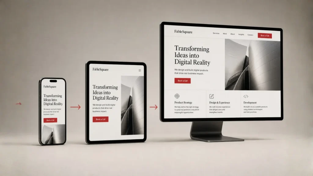
Step 3: Wireframe and Prototype at 390px
All wireframes are designed at 390px width first — the standard modern smartphone viewport. Desktop wireframes come after, expanding the mobile layout into a richer, wider experience without losing the clarity of the mobile-first foundation.
Step 4: Build in Elementor / WordPress or Next.js
Our development team builds on WordPress with Elementor or custom Next.js depending on project requirements. Every section is built and tested at mobile breakpoints before desktop styling is applied. We use container-based layouts that flex correctly across all viewport sizes.
Step 5: Performance and SEO Quality Assurance
Before launch, every page is tested for Core Web Vitals compliance, structured data validity, mobile usability, meta tag completeness, and keyword optimisation via Rank Math. We do not launch a site that scores below 85 on Lighthouse mobile performance.
Step 6: Post-Launch Monitoring
Mobile performance is tracked monthly through Google Search Console and GA4. We monitor mobile CTR, mobile bounce rate, mobile session duration, and conversion rate on mobile versus desktop — with monthly reports that tie back to business metrics, not vanity numbers.
Real Results: Mobile-First Wins for Our Clients
Here are three examples of what mobile first website design delivered for FableSquare clients:
B2B Technology Company (Sigma AVIT)
The existing website was built desktop-first, with navigation that broke on mobile and images that took 9+ seconds to load on 4G. After rebuilding with mobile first website design principles, mobile bounce rate dropped 38%, mobile session duration increased 2.1x, and inbound enquiries from mobile rose 55% within 90 days of launch.
SaaS Brand (Northwind Platform)
A mobile-first redesign combined with an SEO-aligned content architecture drove a 186% increase in organic traffic and a 2.3x lift in trial sign-ups over six months. The majority of that organic traffic growth came directly from mobile search queries.
EdTech Brand (Regal Unlimited)
Landing pages rebuilt with mobile first website design and conversion optimisation — larger CTAs, simplified forms, faster load times — contributed to a 32% reduction in cost per lead and a 2.1x return on ad spend from mobile campaigns.
How to Get Started with Mobile-First Website Design in 2026
If you are unsure where your current website stands on mobile, start with these five steps:
- Run your website through Google PageSpeed Insights (pagespeed.web.dev) and check your Mobile score specifically.
- Open Google Search Console and review the Mobile Usability report for flagged issues.
- Use Chrome DevTools (F12 then Device Toolbar) to preview your site at 390px width.
- Confirm that your headline, CTA, and phone number are all visible without scrolling on mobile.
- Run a Core Web Vitals check and benchmark LCP, CLS, and INP on mobile — not desktop.
If you find issues — and most businesses do — the path forward is either internal fixes or a specialist web design partner. FableSquare offers website audits, mobile first website design rebuilds, and ongoing performance optimisation for businesses across Bangalore and beyond.
Ready to build a mobile-first website that ranks and converts in 2026? Book a free 30-minute strategy call with FableSquare: fablesquare.com/contact
Frequently Asked Questions About Mobile-First Website Design
What is the difference between mobile-first design and responsive design?
Responsive design can start from any screen size and adapt. Mobile first website design specifically starts from the smallest screen and builds upward. This distinction forces better decisions about content priority — producing faster, leaner, more conversion-focused websites that rank higher on Google in 2026.
Does mobile-first website design affect my Google rankings?
Yes, directly. Google uses mobile-first indexing, meaning your rankings are determined by how your mobile version performs. A faster, better-structured mobile site produces higher rankings, better click-through rates, and more organic traffic. This is not optional in 2026 — it is the baseline.
How much does a mobile-first website design project cost in Bangalore?
At FableSquare, project-based mobile first website design engagements start around Rs 2L for tightly scoped builds. Mid-market builds with full SEO optimisation, custom design, and performance engineering range from Rs 3.5L to Rs 8L depending on site complexity and integration requirements.
Can I convert my existing desktop website to a mobile-first design?
Yes. The right approach depends on how your current site is built. In some cases, a targeted performance audit followed by specific optimisations is sufficient. In others — particularly older WordPress sites built without mobile-first principles — a clean rebuild is the faster, more cost-effective path to a genuinely mobile first website design outcome.
How long does a mobile-first website design project take?
A standard 5-8 page mobile first website design and build at FableSquare takes 4-6 weeks from kickoff to launch, including discovery, design, development, QA, and go-live. Larger projects with e-commerce, multilingual content, or complex integrations typically take 8-12 weeks.
What platforms does FableSquare use for mobile-first website design?
Our primary platform is WordPress with Elementor, giving clients the ability to manage content independently after launch. For performance-critical or headless builds, we work with Next.js and custom React frontends. All mobile first website design projects pass Core Web Vitals thresholds on mobile before launch — without exception.
Is mobile-first website design important for local businesses in Bangalore?
“Near me” searches are conducted almost entirely on mobile. If you are a local business in Bangalore — in healthcare, education, food, retail, or professional services — your customers are finding you on their phones right now. Mobile first website design is not optional for local SEO competitiveness in 2026; it is the entry requirement for appearing on Google page one.
Final Thought
Mobile first website design is not a trend. It is the correct way to build for the web in 2026. Google made that decision when it moved to mobile-first indexing. Your customers made it with their thumbs when they stopped pulling out a laptop to find a business.
The businesses that invest in a properly executed mobile first website design — prioritised content, fast load times, clean touch navigation, and Core Web Vitals compliance — are the businesses that show up on page one, earn the click, and convert the visitor.
FableSquare has been doing this work in Bangalore since 2014. If your website is not performing the way it should on mobile in 2026, we would like 30 minutes to show you what a better version looks like.
→ Book a free strategy call: fablesquare.com/contact
→ Our website design services: fablesquare.com/website-design-agency-bangalore
→ SEO and organic growth: fablesquare.com/seo-agency-bangalore
Tags: mobile first website design, mobile first web design, website design Bangalore, responsive website design, Core Web Vitals, mobile SEO, mobile friendly website design, website design agency Bangalore, FableSquare 2026
© 2026 FableSquare. All rights reserved. fablesquare.com
